Filed under: Investing
Although we don't believe in timing the market or panicking over daily movements, we do like to keep an eye on market changes -- just in case they're material to our investing thesis.
Even as Ben Bernanke left the office of Chairman of the Federal Reserve at the end of January, U.S. stocks were unable to give him a proper sendoff, recording their worst month since May 2012, with the benchmark S&P 500 losing 3.6% year to date. What a remarkable lack of gratitude investors are displaying, given that the Fed has been instrumental in reviving the stock market from its March 2009 low! (Still, the Financial Times' Michael Mackenzie is right to put January's decline in context, noting that "the full extent of [the S&P 500's] drop this month merely erased the gains seen during the last two weeks of 2013.")
Following are three graphs that illustrate Bernanke's tenure at the Fed, which began on Feb. 1, 2006, and which saw the bursting of three asset bubbles -- all three of which the Fed had a hand in stoking:
Home prices, adjusted for inflation
Call it extremely poor timing: Bernanke took office as Fed chairman almost at almost the very top of the U.S. housing bubble. Based on the S&P Case-Shiller 20-City Index, shown in the preceding graph, home prices went on to lose roughly a third of their value in real terms before stabilizing. A recovery, which began in 2012, is now under way.
If only the Fed had been more careful in monitoring lending standards and leverage in the financial-services industry and the development of a shadow banking industry that acted like a marvelous bubble engine. Instead, the housing bubble went hand-in-hand with a credit bubble, which, in turn, fed a stock market bubble via a bloated financial sector:
The S&P 500 versus the monetary base
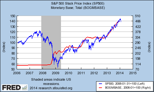
This graph shows the S&P 500 (blue line, rebased at 100) versus the monetary base (red line, also rebased at 100). The monetary base represents the amount commercial banks' reserves held in deposit with the Federal Reserve plus the currency in circulation.
Even after the housing market had peaked, the stock bulls kept running until October 2007, before the stock market bloodletting of 2008, which ran into the first quarter of 2009. However, March 2009 marked the start of a roaring bull market that is nearing its fifth anniversary.
The preceding graph suggests that this recovery is linked to the Fed's three rounds of bond purchases (a.k.a. "quantitative easing"). Last month, the Fed continued to taper its third round of quantitative easing to a monthly rate of $65 billion. There is some evidence that stock valuations got ahead of themselves last year, during which the S&P 500 rose 30%. The $19 trillion question (roughly the total capitalization of all U.S. stocks) is whether stocks can stand on their own two feet even as the Fed begins to withdraw its stimulus.
Some investors, frightened by the notion that the Fed is debasing all "paper assets," have sought refuge in hard assets, such as gold. The irony is that if there is one asset whose price has been distorted by the Fed's unconventional policy measures, it's surely gold:
The price of gold versus real interest rates
One of the key drivers of the price of gold is real interest rates. As interest rates decline, the opportunity cost of owning gold, which has no yield, also falls. The preceding graph shows the price of gold (blue line, left axis) against the yield on five-year Treasury Inflation-Protected Securities, or TIPS, which is the rate investors expect to earn after inflation (green line, right axis). (In fact, it's the negative of the TIPS rate, i.e., when the rate falls, the green line goes up.)
The graph illustrates the tight link between gold and real interest rates in a period of falling rates and in 2013, as rates fell. If rates continue to normalize, investors who own bullion or (more likely) the SPDR Gold Shares ought to expect further losses.
Building wealth: Here's the one stock you must own in 2014
There's a huge difference between a good stock and a stock that can make you rich. The Motley Fool's chief investment officer has selected his No. 1 stock for 2014, and it's one of those stocks that could make you rich. You can find out which stock it is in the special free report "The Motley Fool's Top Stock for 2014." Just click here to access the report and find out the name of this under-the-radar company.
The article Ben Bernanke's Fed Tenure: 3 Graphs for 3 Bubbles originally appeared on Fool.com.
Copyright © 1995 - 2014 The Motley Fool, LLC. All rights reserved. The Motley Fool has a disclosure policy.
Read | Permalink | Email this | Linking Blogs | Comments